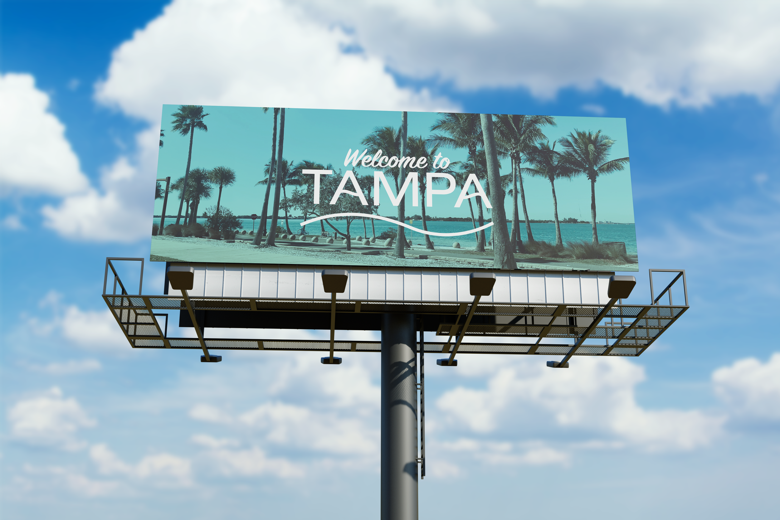
Locale Branding: Tampa
Graphic Design 2
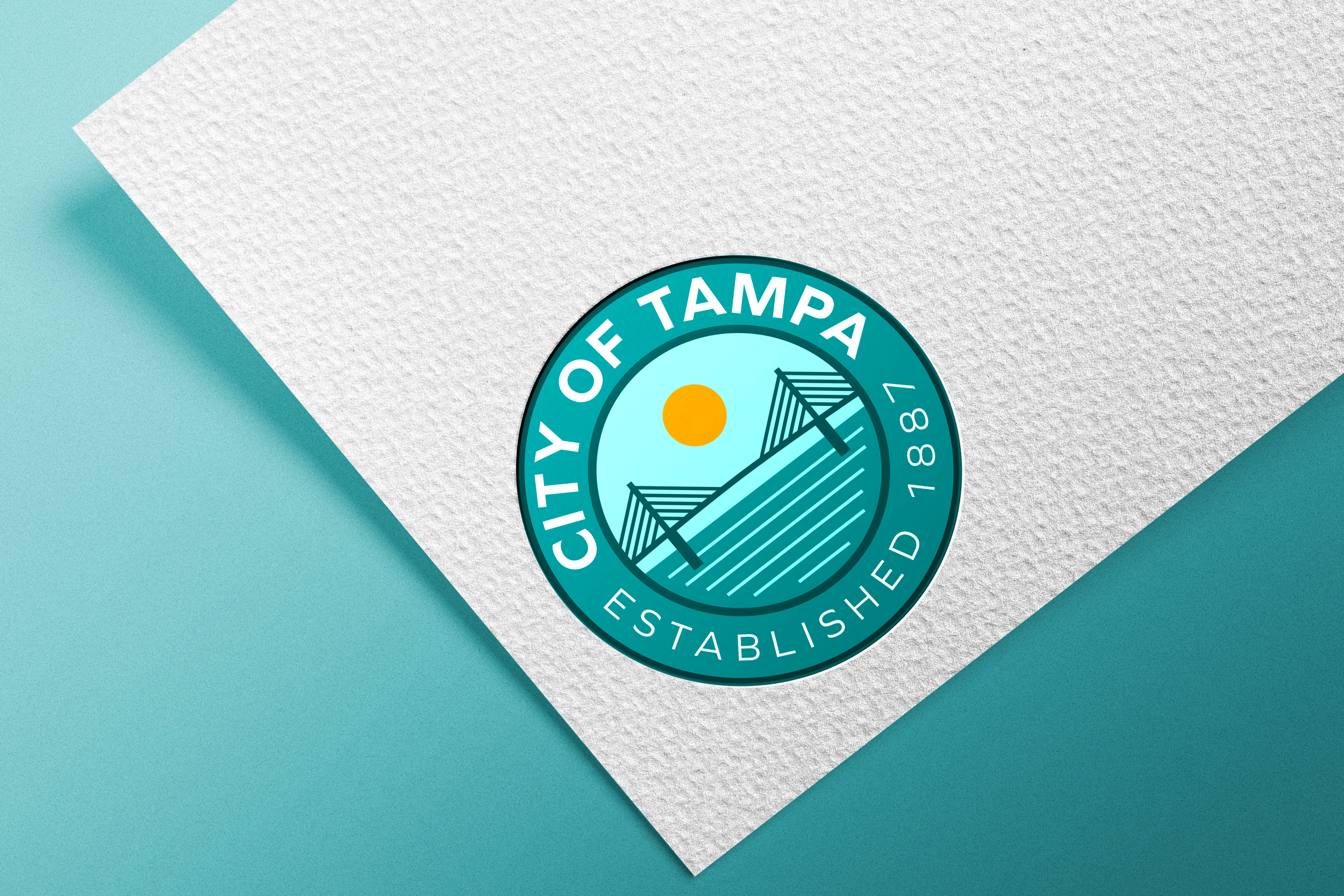
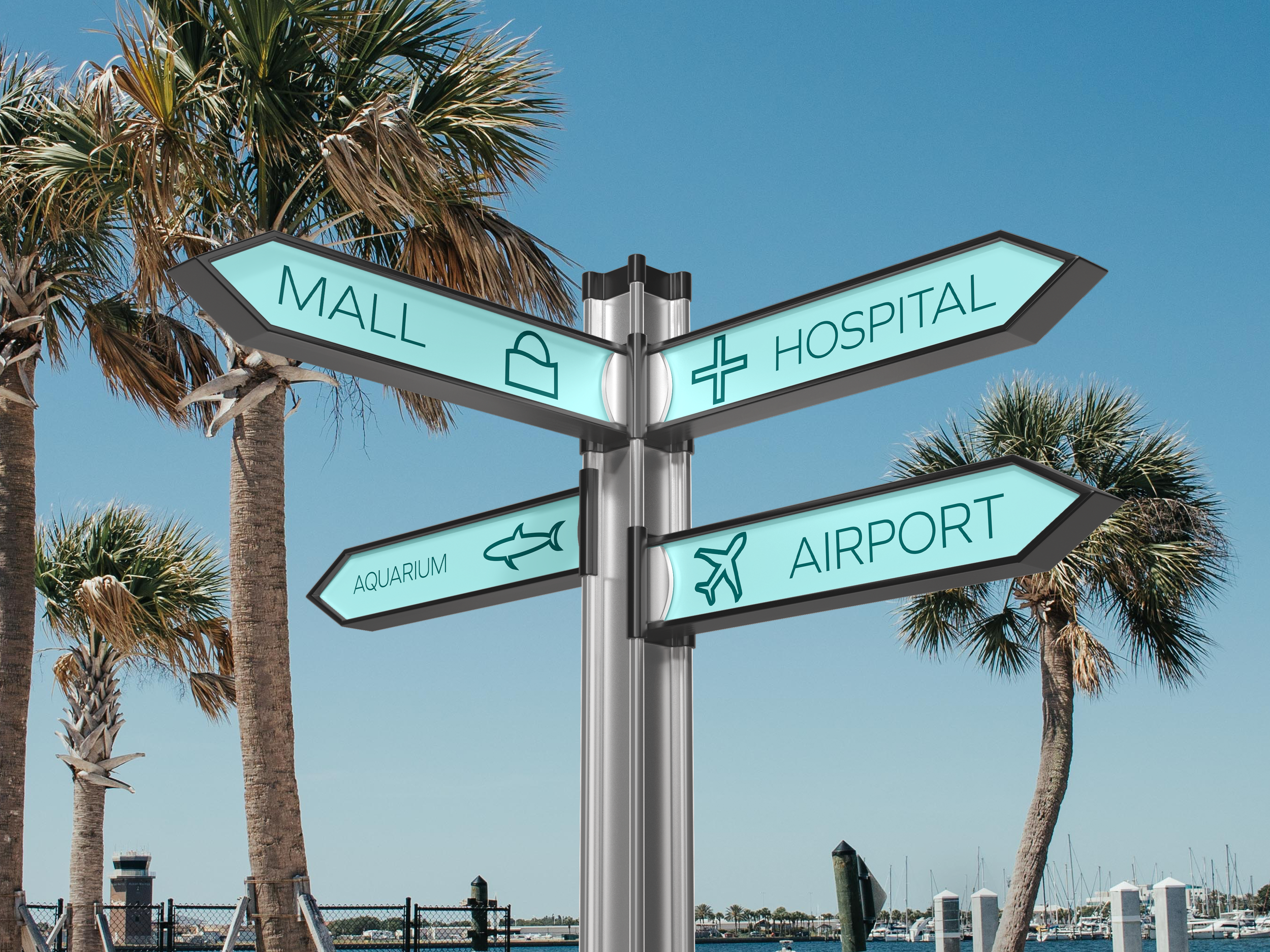
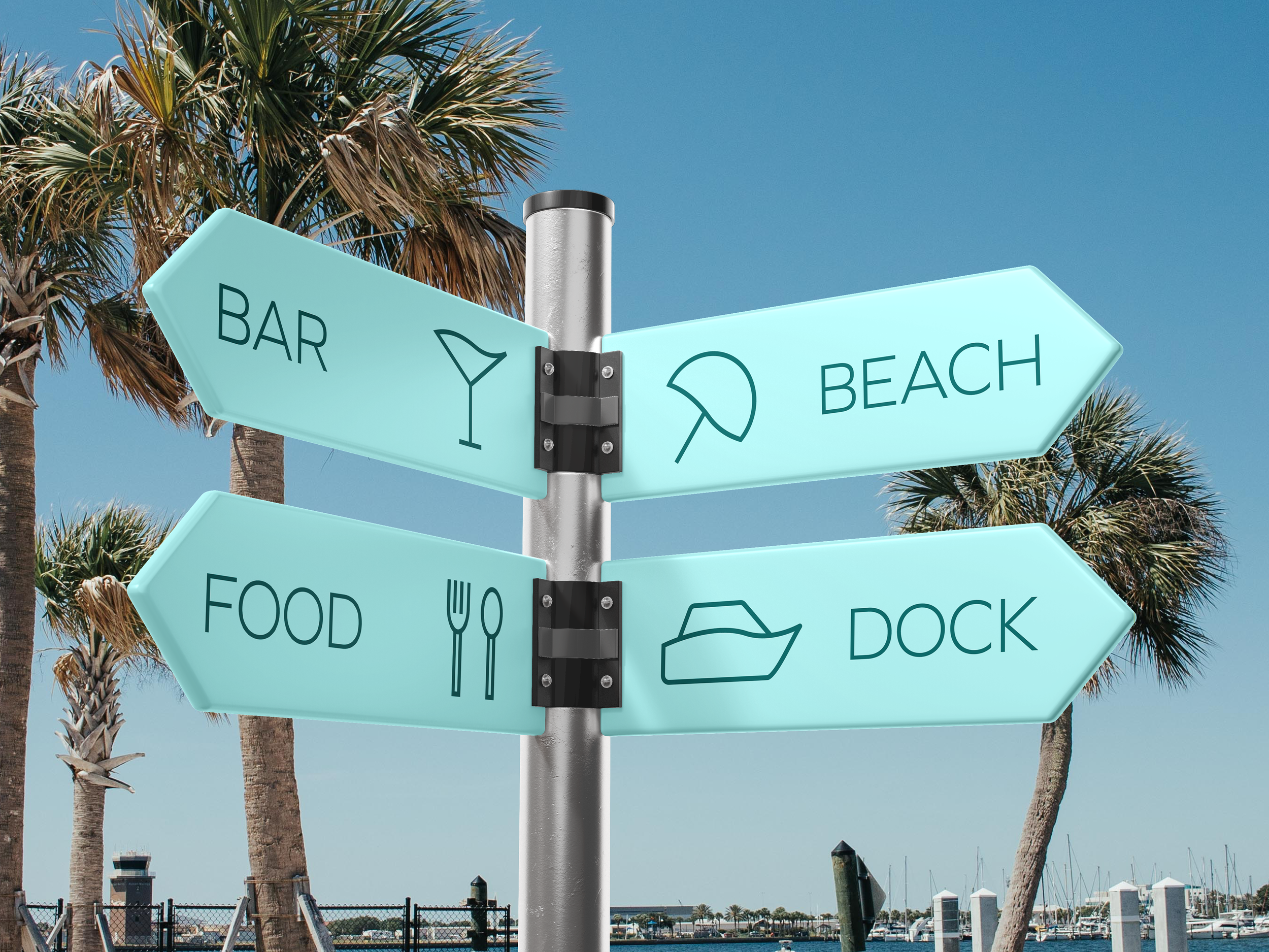
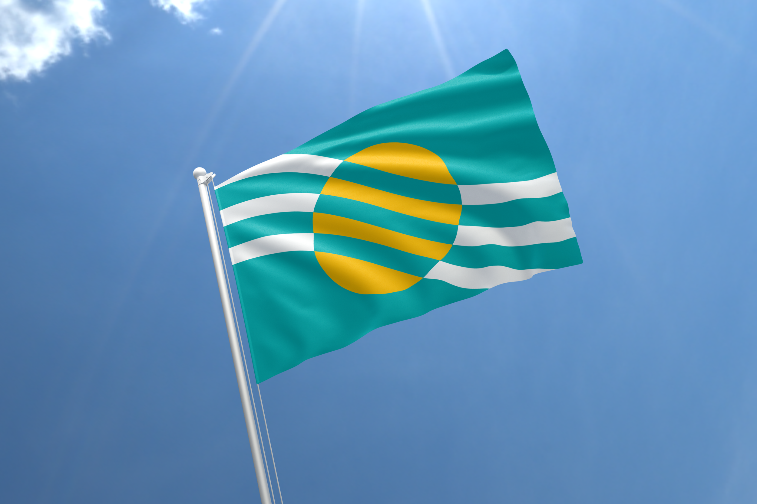
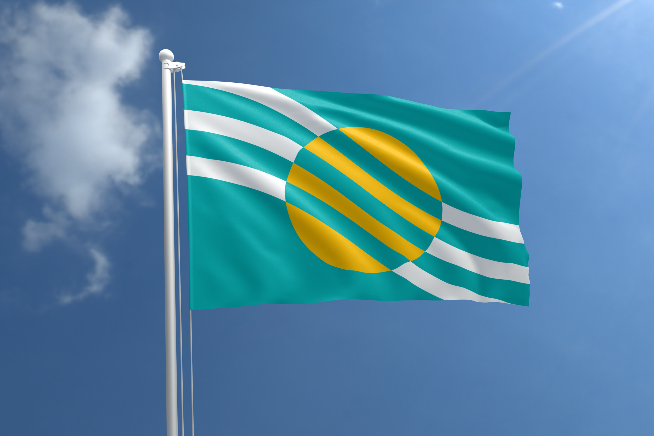
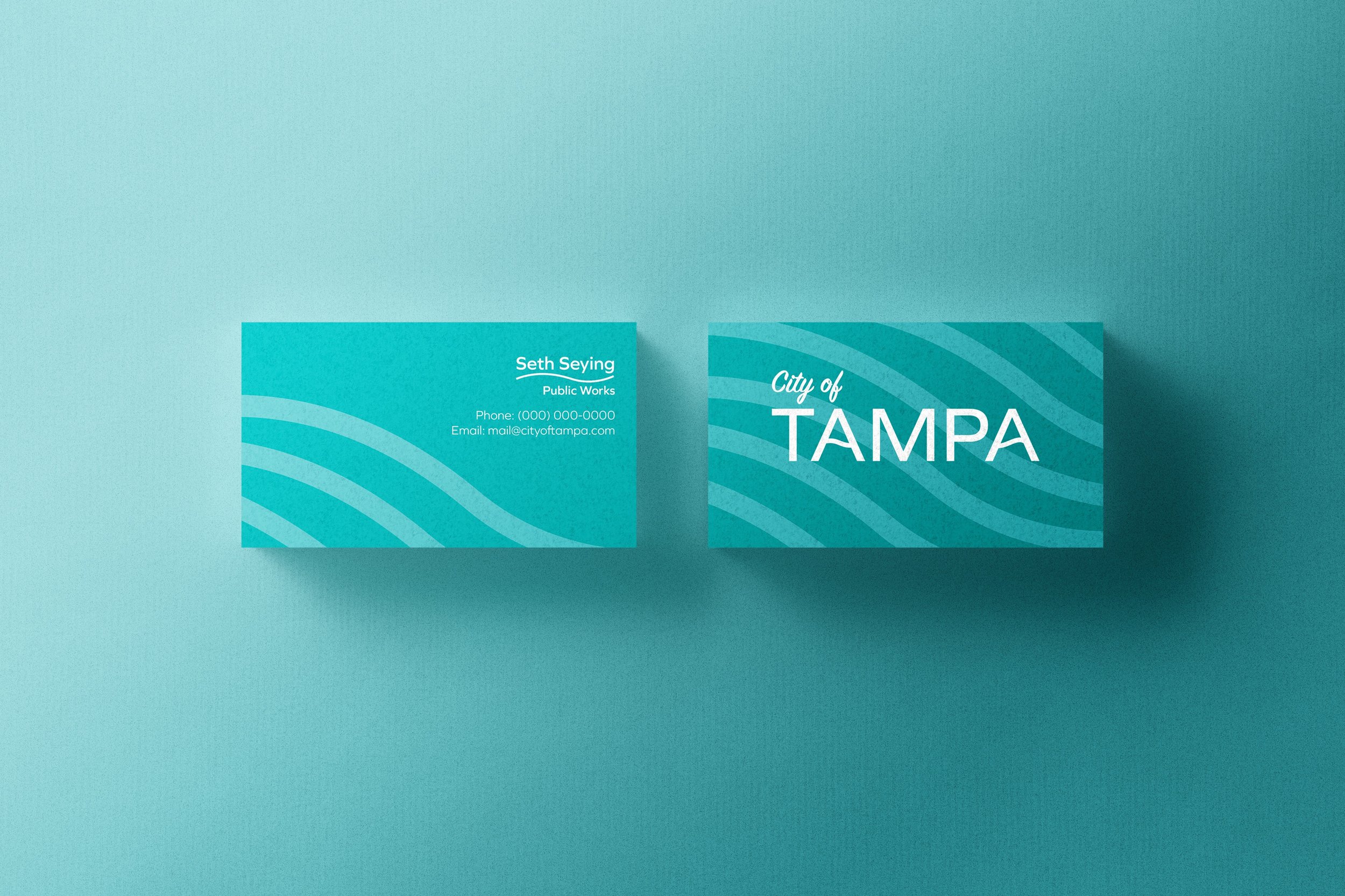
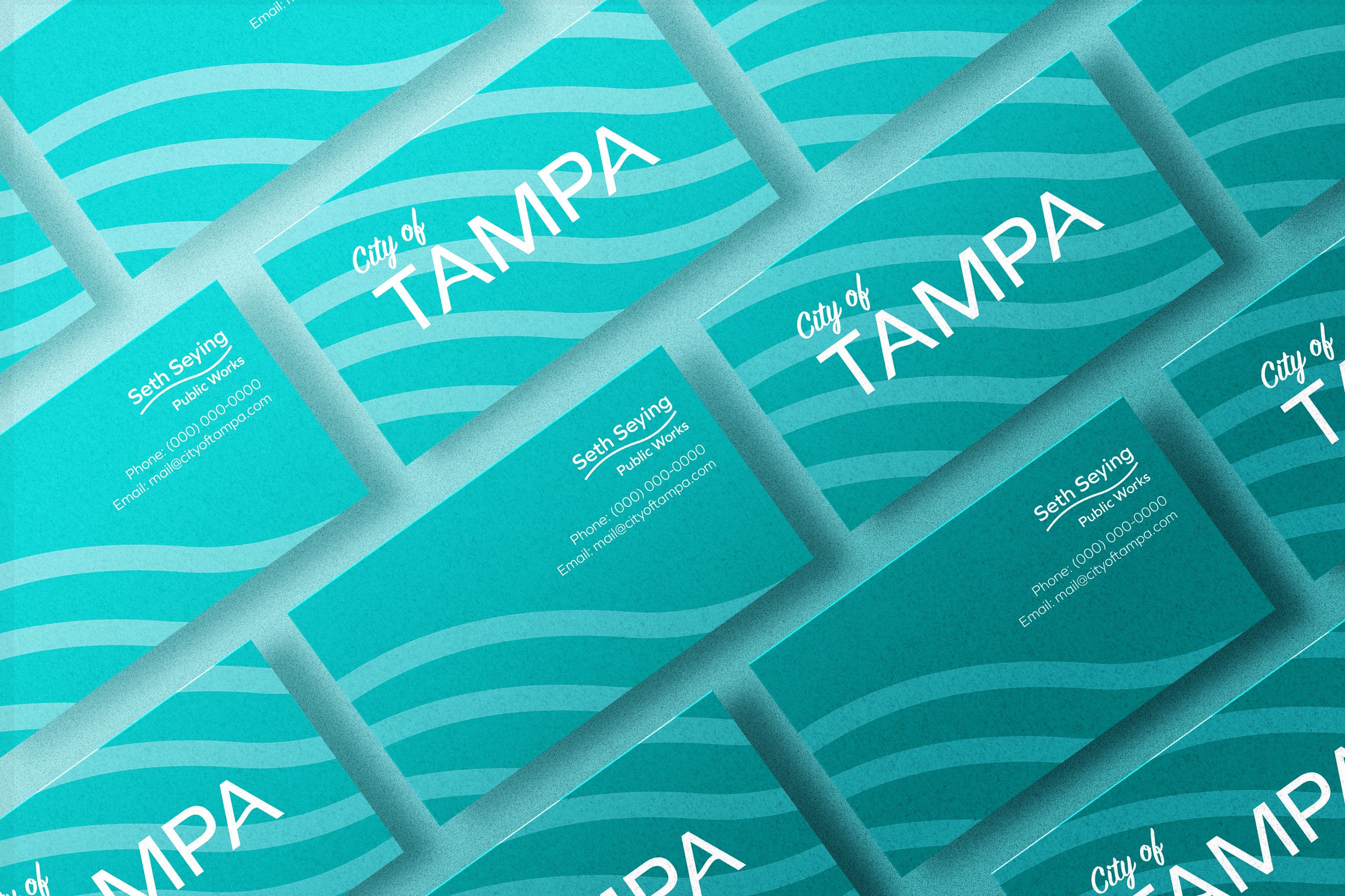
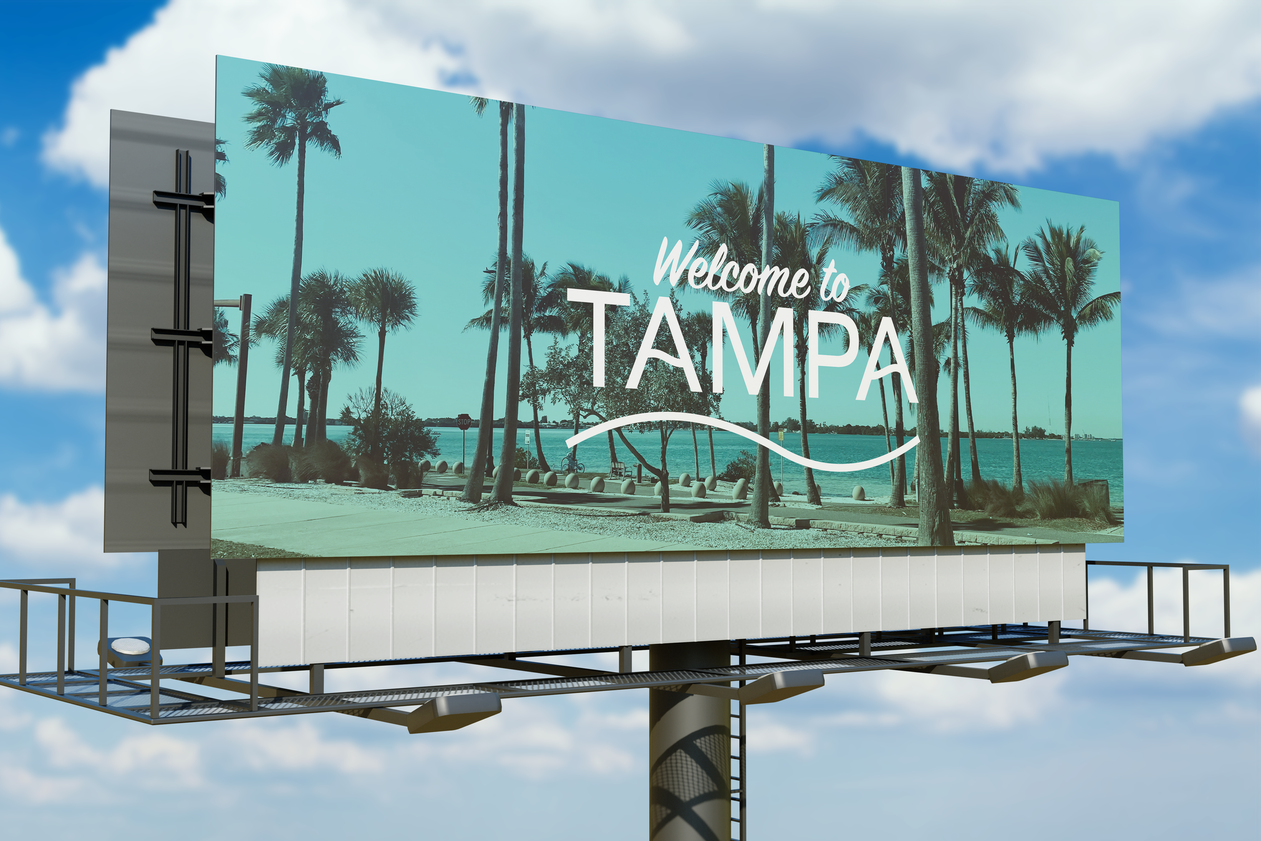
I designed a visual system for the city of Tampa. The system included a flag, a symbol or seal, an iconography system, and three brand extensions. For the overall design, I used the waves on Tampa's beaches as the focal point. I chose various shades of teal to represent the beautiful color of the ocean in Tampa and yellow/orange to incorporate Florida's nickname, "the sunshine state.” Throughout the branding, I included a wave stroke, whether it was the logo or the iconography of the signage. I tried to incorporate this wave stroke in all of the branding elements that would be appropriate.
